Some of my happiest memories are around my grandmother’s massive, dark wood table in her formal dining room, eating Sunday lunches with aunts, uncles, and cousins.
I remember my tiny table in my first apartment, cheerfully decorated for the holidays and desperately trying to impress my now husband.
Dining rooms are spaces where we celebrate family occasions, share precious news, and build friendships. What are the best paint colors for these special rooms?
The best dining room paint colors by Benjamin Moore are Ice Mist, Kendall Charcoal, Rainforest Foliage, and Adriatic Sea. Behr fan favorites include Rumors, Sweet Coconut Milk, Gentle Sea, and True Copper. Or try Sherwin-Williams’ Taiga, Functional Grey, Glamour, or Icy Lemonade.


Choosing the Best Paint Colors for a Dining Room
Dining rooms are more than spaces where we eat — they’re where we share our day’s news, celebrate family birthdays and Thanksgiving, and entertain guests.
With most families struggling to find time to sit and eat together, dining rooms are used less and less, especially if they’re formal spaces.
I want a revival of the dining room as a place where the family meets at least once a day, whether a nook off your kitchen or a separate room with a 20-seater table and chairs. The color you paint the room sets the tone for the many meals you’re going to share.
Let’s look at the fan favorites from three luxury paint producers.
Best Benjamin Moore Dining Room Paint Colors
Choose one of Benjamin Moore’s paint colors to dress up your dining room, readying it for family lunches and cozy dinners where your guests won’t want to leave. These are my top four picks:
#1. Ice Mist 2123-70


A clear, bright white is an excellent choice if you like to decorate your dining room for different seasons and occasions. Ice Mist is a fresh, clean shade with a bright blue undertone that makes the room feel spacious and tranquil.
Layer in your chosen color palette, whether you’re adding blues for a coastal vibe or deep reds to match your antique furniture.
#2. Kendall Charcoal HC-166


Gray is one of the most popular dining room colors, with its elegance and sophistication. However, this season’s grays, like Kendall Charcoal, are a little more dramatic.
Deep charcoal creates a moody vibe in your dining room, perfect for cozy evening dinners. Accessorize with your family silver — or any silver you have to hand.
#3. Rainforest Foliage 2040-10


Another approach to dining room decor is to embrace gorgeous jewel tones. These colors work even in smaller dining rooms, creating a jewel-box effect.
This magnificent green adds an air of sophistication and luxury to a room, especially if you layer in brass elements and brocade drapes and upholstery. I also love this color paired with natural textures and earthy tones for a comfortable and inviting eating area.
#4. Adriatic Sea CSP-660


Another bold option for your dining room is a gorgeous teal blue. This inky shade creates a tranquil atmosphere, ideal for a busy family dining room.
It’s perfect with a coastal palette but is also ideal for a more formal, traditional space with cream and brass accents.
Top Behr Dining Room Paint Colors
You can let your personality shine when choosing a dining room paint color. Choose a more demure shade if you’re an introvert who invites only close family and friends.
Extroverts and those who are the life and soul of the party, go for something bright and fabulous. Here are my top picks from Behr.
#5. Rumors MQ1-15


Behr’s Color of the Year for 2025 has just been released, and it’s the perfect color for updating your dining room. Rumors is a deep ruby red, a jewel tone that works well in dramatic and elegant dining rooms.
Pair this rich, passionate shade with metallic finishes, especially gold, and balance it with light neutrals like greige, gray, and tan.
#6. Sweet Coconut Milk M230-1

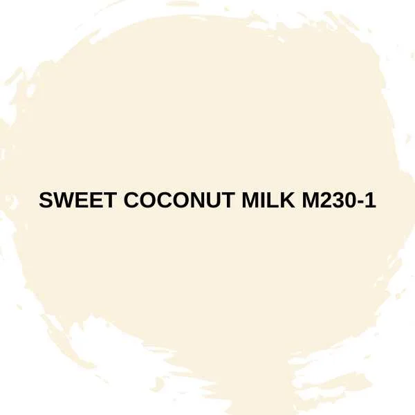
Neutrals are always successful in dining rooms, especially if you like a minimalist or Scandi vibe. The deliciously named Sweet Coconut Milk is a warm white with a subtle hint of coral that adds interest to a neutral palette.
Decorate with blond or bleached wood and layered textures for a dining room that is as appealing for breakfast as dinner.
#7. Gentle Sea S470-2


Pale sky blue, paired with white, is a classic choice for a peaceful dining room. This palette works for rustic farmhouse or cottage core interiors, coastal, and Scandi looks.
Gentle Sea is the perfect light blue, neither pastel nor intense.
#8. True Copper S180-7
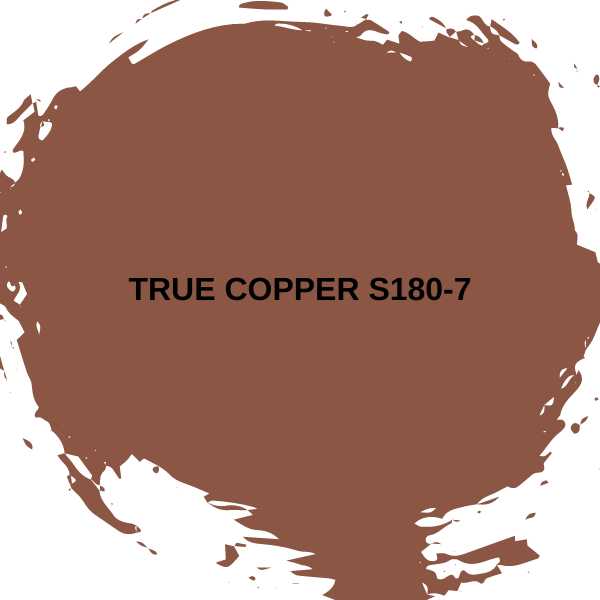

True copper is a deep reddish brown, a lovely rust color from the trending earth tones palette. It’s incredibly warm and cozy, creating an inviting atmosphere for your family and friends.
Layer in other orange, brown, and green earth tones for a convivial ambiance.
Best Sherwin-Williams Dining Room Paint Colors
You can count on Sherwin-Williams to provide a beautiful selection of paint colors for your dining room. There are colors to get creative with and some stalwarts that you can rely on for a pleasing, hospitable vibe.
Many of the colors Sherwin-Williams recommends are neutrals; I’ve added a couple more of my favorites.
#9. Taiga SW 9654

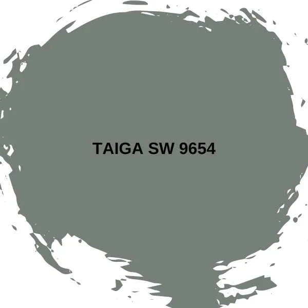
Muted greens continue to be popular, especially in the kitchen and dining room, for their calming effect. A muddy sage like Taiga has a gentle blue undertone, giving it an elegant, old-school feel.
Pair it with rich cream trim and antique furniture. It’s also utterly contemporary and works well in organic modern interiors.
#10. Functional Gray SW 7024

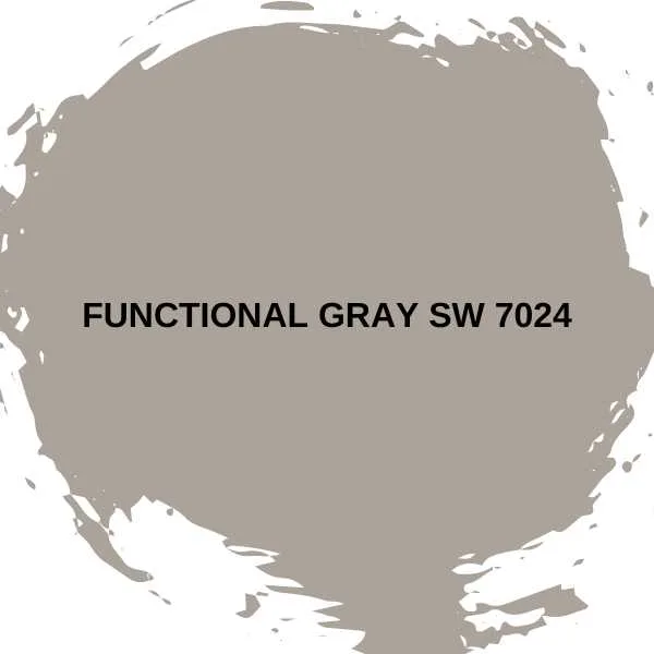
I’m a huge fan of the earth tones trend from the last few years. These cozy tones create warm, inviting spaces, so they’re perfect for dining rooms.
Functional Gray is, indeed, functional: this lush gray-brown is the color of clay, comforting and grounded. It’s equally at home in a rustic or Boho interior as it is in an edgy minimalist environment.
#11. Glamour SW 6031
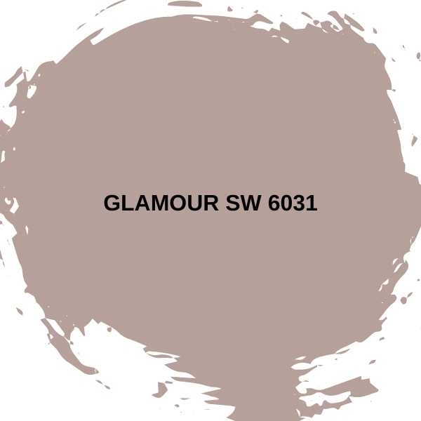

Sticking to the earthy shades, Glamour is a gorgeous dusty terracotta pink that will transform your dining room. This is an excellent choice if you want more color than a neutral, but aren’t wild enough for a fire-engine red space.
Lighter neutrals make smaller rooms seem bigger, while this gentle pink creates a peaceful atmosphere that will keep your guests around the table until the candles burn down.
#12. Icy Lemonade SW 1667


This delicious buttery yellow is from Sherwin-Williams’ 2025 color Capsules collection, specifically the Kindred color palette. These specially chosen colors celebrate communal well-being, making them perfect for a dining room.
Sunshine yellow is uplifting and works well for dining rooms used during the day, even if they don’t get a lot of natural light.
Final Thoughts
I love choosing paint for a dining room because it’s a room that invites you to express your creative side. Whether you want to welcome friends and family with a gentle neutral-colored retreat or wow them with a jewel box of a room, a paint color by Benjamin Moore, Behr, or Sherwin-Williams will be perfect.
Related Paint Color Articles:
- Top 8 Paint Colors for Kitchen Walls
- Top 11 Living Room Paint Colors
- 10 Relaxing Bedroom Paint Colors
- Top 7 Paint Colors for Windowless Bathrooms

